 Try ShortPoint now
In this article, we will walk you through how to insert and customize the Panel Design Element in SharePoint web pages.

TABLE OF CONTENTS
Prerequisites
- You have the latest ShortPoint public version installed for your environment.
- You are a ShortPoint Designer with an active license.
Step-by-step Tutorial
Follow the steps below to learn how to customize the Panel Design Element:
Step 1: Insert the Panel Design Element
Get Started to learn how to insert the Design Element:
NOTE: Check out ShortPoint Basics: How to Insert a ShortPoint Design Element in Live Mode for more details.
Step 2: Customize your Panel
Choose the Style (1) and Color (2) of your panel.

Add a Panel Title.

(Optional) You can also add Panel Subtitle (1) and Icon (2).

Adjust the size of your panel using the blue slider.

Once done, click the green check mark.

Step 3: Add an Element Inside the Panel
NOTE: There is already a default Text element inside the panel. You need to remove this to insert a different element inside the panel.
Click the Text tag and select the delete icon.

Click the black plus icon to insert an element inside the panel.

Choose the element you prefer.
For the purpose of this guide, we will add a List.

Edit the element you added according to your preference.

Step 4: Save
Once you are satisfied, click Save.

Then, click Republish.

Congratulations! You can now add panels to SharePoint web pages.
Panel Features
There are many ways to customize the features of the Panel Design Element. In the settings window, you will find the following tabs:
A. Content Tab
You can modify the content of the Panel in the Content Tab. Below are the settings you can configure:
SETTINGS
 | Title | modifies the main title of the panel. |
 | Subtitle | modifies the subtitle of the panel. |
 | Icon | choose from a list of icons to display inside the panel header. All icons are available on the ShortPoint Icons page. |
 | Content | allows you to add content inside the Panel. |
LINK
 | Link Text | allows you to assign a name to the link. |
 | Link | add the URL of the page where you want to redirect. |
B. Design Tab
You can modify the default design of the element in the Design Tab. Below are the settings you can configure:

SETTINGS
 | Style | choose from a set of pre-defined styles including Panel, Solid, Boxed, Transparent, Mini Solid Header, Solid Header, or Gradient. |
 | Color | customize the color of your panel. By default, the Design Element follows the color settings of your page as the primary color. All ShortPoint Colors are supported. |
 | Height | allows you to customize the height of the panel in px, %, or em. |
 | Roundness | allows you to round the corners of the Panel Design Element. You can modify the roundness value by [1] using the blue slider, [2] typing the value in the white box, or [3] using the up or down arrows. You can learn more about the Roundness in Introducing the Roundness Feature: What It Is and How to Use it. |
LINK
 | Link Type | choose the style of the link. It can either be shown as a simple link or a button. |
 | Linking Options | choose how your link will open including:
|
SHADOW
NOTEIf you want to know more about the Shadow feature, check out How to Apply Shadow Styles for Design Elements.
 | Preset | lists all the shadow styles you can use. |
 | Vertical distance | allows you to adjust the shadow to the left (negative value) or right (positive value) of the element. |
 | Horizontal distance | allows you to adjust the shadow up (negative value) or down (positive value) of the element. |
 | Blur | allows you to control how soft or sharp the shadow appears. The higher the value, the softer the shadow is. |
 | Spread | allows you to expand (positive value) or shrink (negative value) the size of the shadow. |
 | Position | allows you to choose where the shadow will be, inside or outside the box. |
 | Color | allows you to choose the color of the shadow. You can [1] add the HEX code, [2] use the drop-down, or [3] use the color picker to select the color you want to use. |
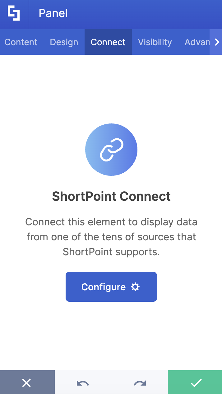
C. Connect Tab
The Connect tab allows you to link the Design Element to SharePoint sources (List, Document Library, News, etc.) and other external sources (Microsoft Graph API, Teams, Outlook, etc.). For more details about ShortPoint Connect, check out Basic Tutorial: How to Establish Seamless SharePoint Connection with ShortPoint Connect.
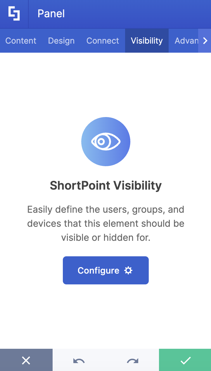
D. Visibility Tab
The Visibility tab allows you to specify who can see the Design Element and what type of devices it can be shown on. For more details, check out How to Use the ShortPoint Visibility Feature for Effective SharePoint Access Management.
E. Advanced Tab
This tab allows you to further customize the Panel Design Element. Below are the options available:

MISCELLANEOUS
 | Header Background Color | allows you to choose from a list of pre-defined colors for the panel header. |
 | Background Color | allows you to choose from a list of pre-defined colors for the panel background. |
 | Color Transparency | allows you to set the color transparency of the background color. |
 | Effect | allows you to add an outer-shadow effect below the Panel. |
 | Content Color | allows you to set the color of your text. |
 | Custom Width | specifies the width of the panel. Values can be in pixels (px) or percentages (%). |
TITLE
 | Title Bold | makes your title bold. |
 | Title Size | adjusts the size of the panel title. Values can be in pixels (px) or percentages (%). |
 | Title Text Color | allows you to specify the color of your title. |
SUBTITLE
 | Subtitle Size | adjust the size of the panel subtitle. Values can be in pixels (px) or percentages (%). |
 | Subtitle Text Color | allows you to specify the color of your subtitle. |
 | Subtitle Location | allows you to choose whether to show the subtitle next to the title or below it. |
ICON
 | Icon Size | modifies the size of the icon. |
 | Icon Color | specifies the color of the icon. |
SEPARATOR
 | Separator Style | choose from a list of separator styles including normal, dashed, dotted, or none. |
 | Separator Color | specifies the color of the separator. |
 | Separator Size | specifies the size of the separator. |
LINK
 | Link Color | specifies the color of the link. |
 | Link Position | choose whether to show the link in the panel header or at the bottom of the panel. |
BORDER
 | Border Style | choose from a list of border styles including normal, dashed, dotted, or none. |
 | Border Size | modifies the size of the panel border. |
 | Border Color | modifies the color of the panel border. |
F. Custom CSS Tab
This tab allows you to use your own CSS, HTML, and JavaScript code to customize the Panel Design Element.
NOTE: Check out our support articles on How to Insert Custom CSS into a Page Builder Element? (Basic Tutorial) to know more about Custom CSS.

Related articles:
